LinkPreview
A link preview component.
This component creates a link preview displaying the link text, an optional description and an optional OG image. It is geared towards displaying internal links, e.g. to a blog post. But it can also be used for external links.
This component cannot fetch link metadata on its own due to a browser’s same origin policy. Reading link metadata needs to be done server-side by the SvelteKit application that consumes this component.
Props
A LinkPreview component has the following properties:
| Prop | Required | Description |
|---|---|---|
value | yes | Link meta data of type LinkMeta. |
class | no | Additional Tailwind classes. |
Examples

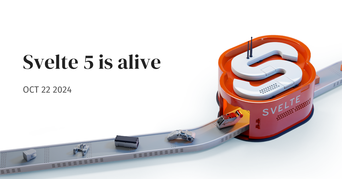
Our biggest release yet.

Wij zijn het ANP, beginnen altijd met de feiten en leveren sinds 1934 onafhankelijk nieuws aan media. Ontdek ook onze communicatiediensten.

We’re sharing the bigger motivation and business plan behind offering a free plan for cloud computing.

Learn how to bring smooth, animated navigation to multi-page apps with view transitions. With just one line of CSS, you can enable seamless transitions between pages.